
The real learning curve of this whole process is how many things worked out vs what didn't. Almost nothing works first time unless you have a solid idea of how you envision it, you find yourself tweaking a bit here or there, changing a colour, font or any other element that you feel could look better different.
Now, I definitely imagined this to be the most bulky of blog posts, mostly because I presumed virtually everything would go wrong and I'd spend hours making it right. And yes, I did spend hours, but that's only because I'm a perfectionist.
If I made something in one colour then you can bet I made it in about 5 others, it's the only way I can have a range to select from and produce more ideas. That would explain how I ended up with ten different from covers.
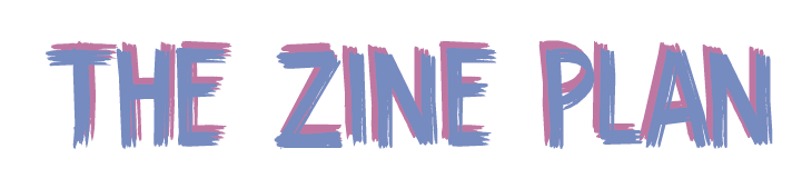
I'll admit, I only created to zine headers/logos, simply because I'd decided on my fonts relatively early on and knew what I wanted to stick to, however in the end I chose the more cursive font. Now, it might seem like a strange choice for a zine showcasing alternative style, however my zine is to cover a wide range of topics over multiple issues so I needed something that could fit each different issue.

Trial and error has been my big motto throughout the creative process.
Handwritten vs Type
Text vs No Text
Colour vs Black & White
It's interesting to look back on these now and see how my ideas have evolved, whilst they're all relatively similar, each small change has turned into something that I'm now content with and am happy to present in my final publication.
And yeah, I'm really big on that brush stroke effect.


